My Personal Identity
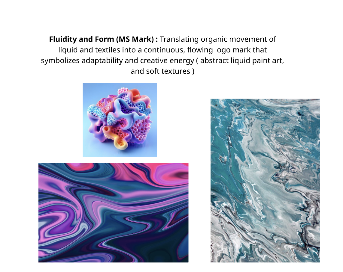
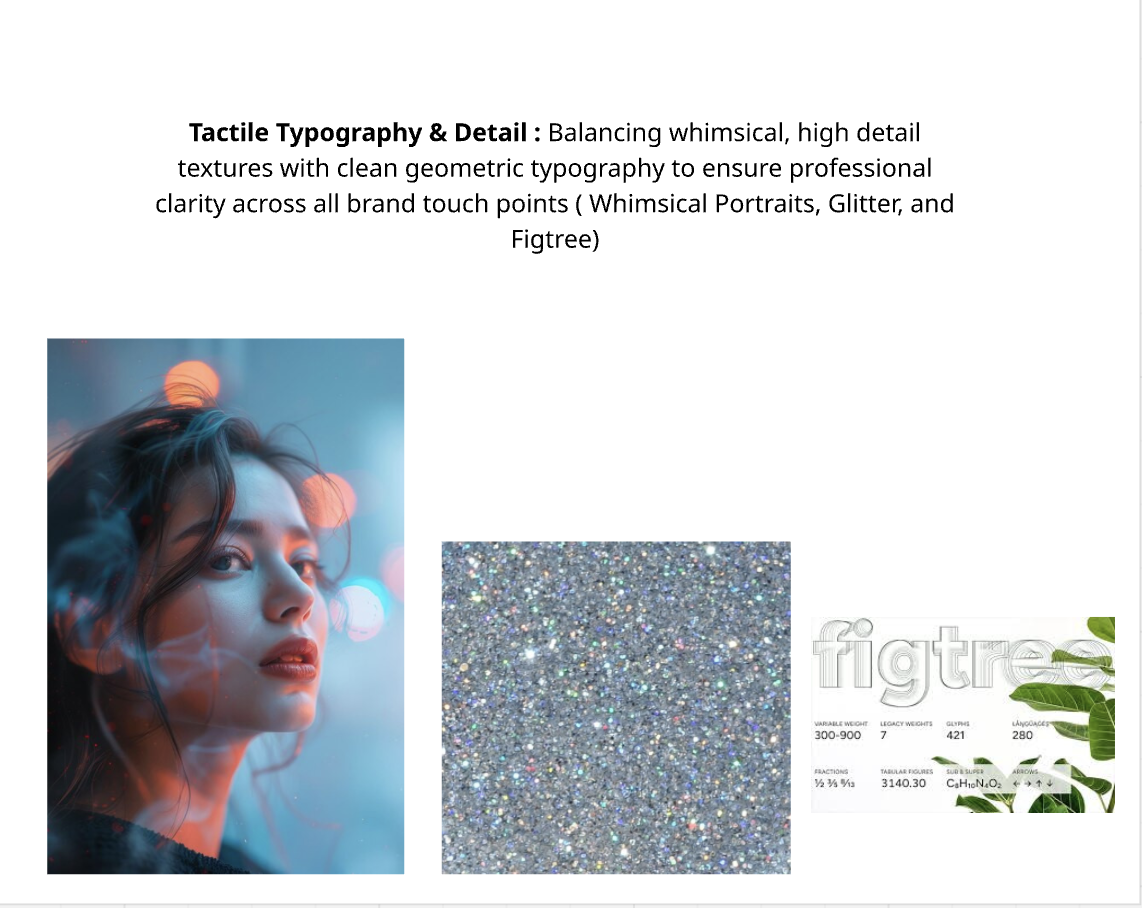
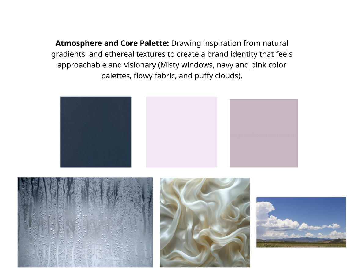
Driven by a philosophy of "professional playfulness," my personal identity is a sensory celebration of form, texture, and digital precision. The visual system bridges the gap between structured UI/UX design and organic, dreamlike aesthetics. Anchored by an ethereal mood board—featuring fluid satin, abstract liquid paint art, and atmospheric light—the brand evokes imagination and curiosity.
Outdated Visual Identity: My previous branding no longer reflected my current technical skill level or professional growth.
Narrative Gap: my previous identity failed to showcase my diverse background in graphics, UI/UX and Illustration.
Problem
Unified Visual System: Developed a single cohesive brand identity that anchors all professional materials.
Scalable Identity: Created a versatile logo and color system designed to grow alongside my design career.
Solution
Target Audience
Primary: Creative Directors & Design Agency Leadership
Who they are: Creative Directors, Head of UX/UI, Senior Art Directors, and Design Agency Owners.
What they care about: They need to see a portfolio that demonstrates tactile storytelling backed by technical execution. They aren’t just looking for someone who can make things look pretty; they want a collaborator who understands user flows, respects brand systems, and can hit tight deadlines without hand-holding.
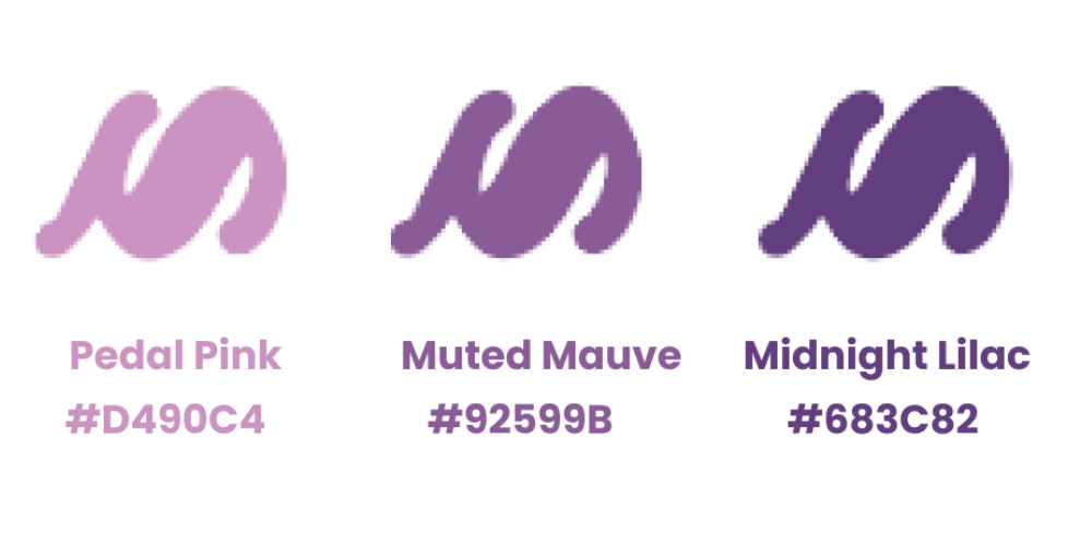
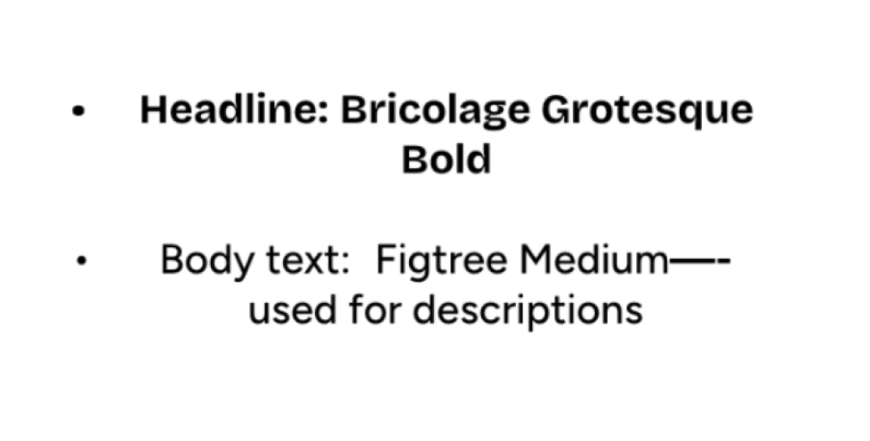
Why your brand appeals to them: Your portfolio balances an incredibly bold, distinct personal aesthetic (the deep purples, smooth organic shapes, and playful typography) with highly structured case studies (Mythcellany, Cycle Sync). It tells them you have a strong creative voice but know how to build functional digital products.: Creative Directors & Design Agency Leadership
Secondary: High-Vibe, Impact-Driven Small Businesses & Startups
Who they are: Wellness practitioners (like Amber Attuned Yoga), indie entertainment/animation studios, boutique app founders, and community-centric local businesses.
What they care about: They want an authentic connection. They look for a designer who is "kind, personable, and passionate" (exactly what your testimonials highlight) who can make their brand feel both premium and approachable. They need a comprehensive solution—someone who can handle the logo, the website strategy, and the social media presence.
Why your brand appeals to them: Your work feels human and deeply intentional. The soft organic curves in your new logo mark and the strategic, structured layout of your portfolio communicate that you will treat their business with both creative passion and professional precision.
Visual Guide
INSPIRATIONAL MOODBOARD
Logo Journey
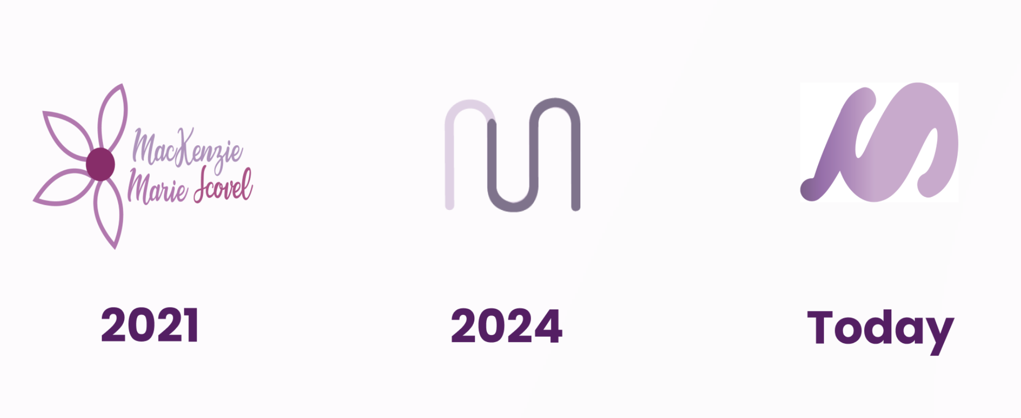
2021: The Foundations
The Style: Delicate, literal, and whimsical.
The Elements: A fine-line floral script mark paired with hand-written, expressive typography for your name.
The Vibe: This logo feels introductory and deeply personal. Using a flower motif and full script text represents a stage of exploring identity, carrying a gentle, organic, and approachable creative energy.
Today: The Refined, Confident Identity
The Style: Bold, fluid, and expertly organic.
The Elements: A thick, high-contrast abstract monogram that seamlessly blends the initial "M" with a fluid, wave-like motion. It is rendered in a solid, confident orchid-purple.
The Vibe: This is the perfect bridge between your past eras. It takes the abstract, professional monogram concept from 2024 but injects it with the playful, fluid, and sensory energy of your current mood board. The heavier weight gives it incredible presence, scalability, and authority, while the sweeping curves make it feel dynamic and artistic rather than rigid.
2024: The Transition to Minimalism
The Style: Abstract, structured, and geometric.
The Elements: A continuous, single-line monogram forming an "M" with a distinct color split (a soft, faded lavender transitioning into a solid, deeper mauve).
The Vibe: A massive leap into professional abstraction. By dropping the literal flower and full name text, this mark focuses entirely on form and minimalism. The clean curves show a growing interest in UI/UX and structured brand systems, prioritizing clever simplicity over decoration.
Logo Breakdown
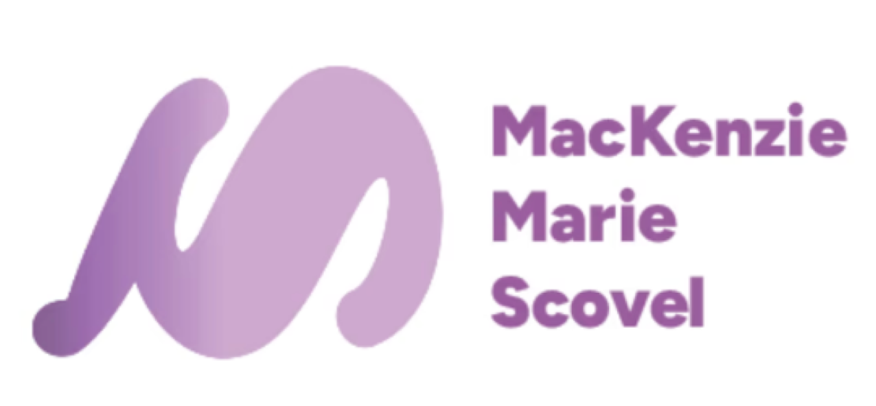
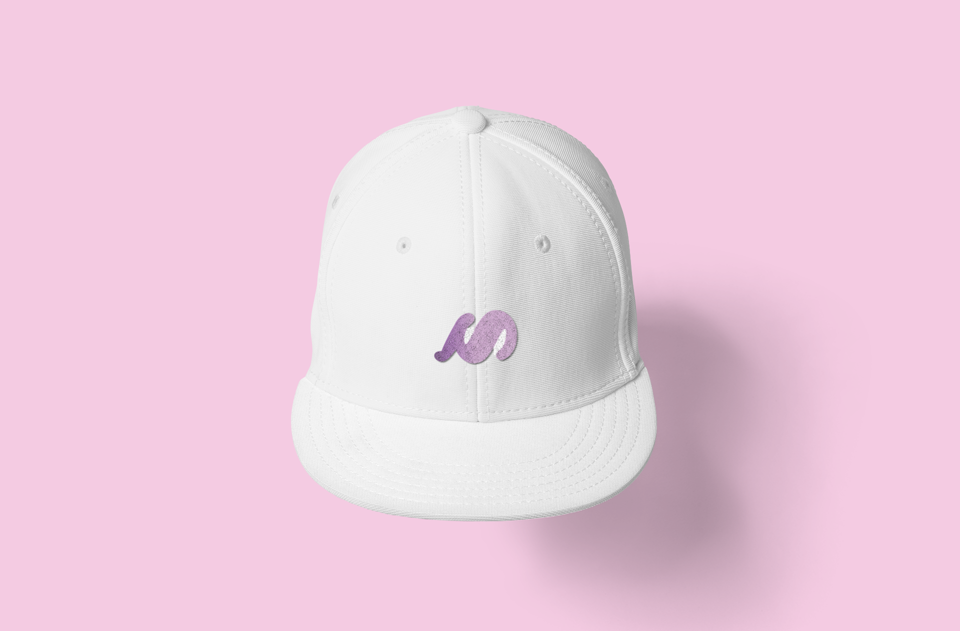
This design is meant to be more than just a literal initial; it’s smooth flowing lines reflects the organic, playful and versatile attributes I bring to every project. By avoiding sharp edges, the logo communicates a sense of creativity, motion and openness. As a constant feature on all my pages of my website ( home, projects, contacts), it anchors a diverse body of work—-from the professional layouts on my resume to the visual projects like “Endo Ease’”and “Galaxy Eye Records”— with a single memorable signature.
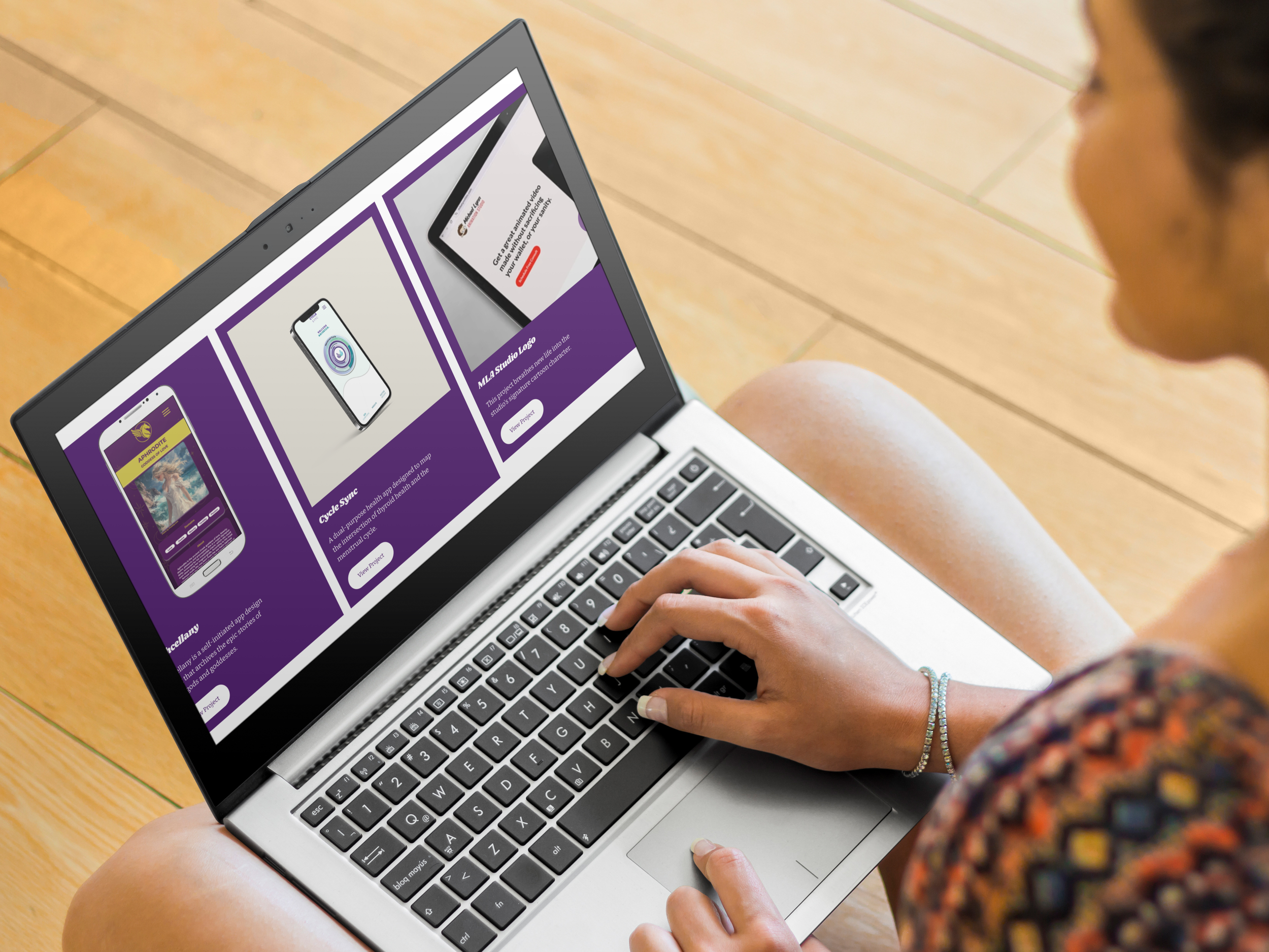
Visual Touchpoints
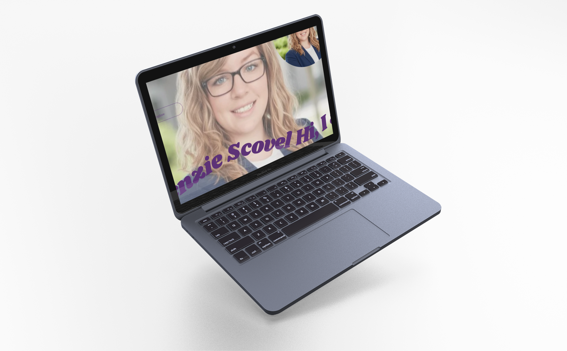
Desktop
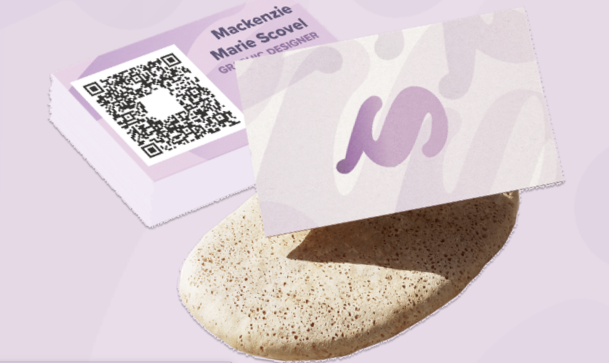
Business Card
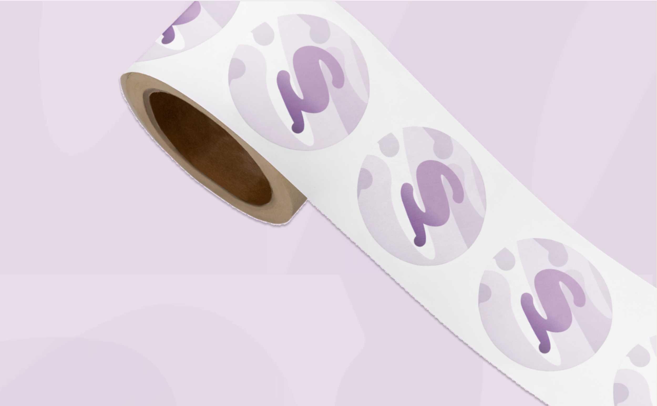
Stickers
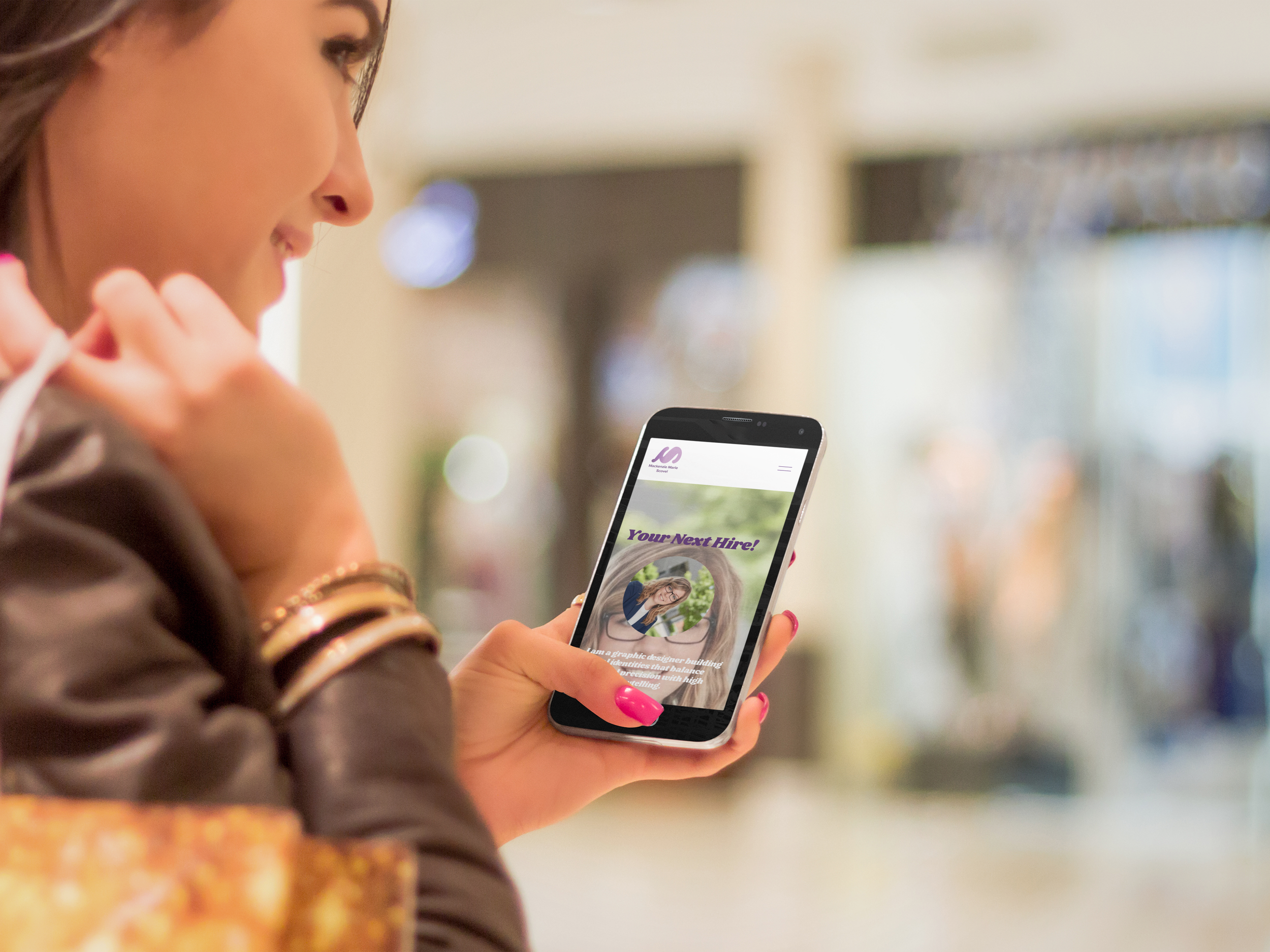
Mobile
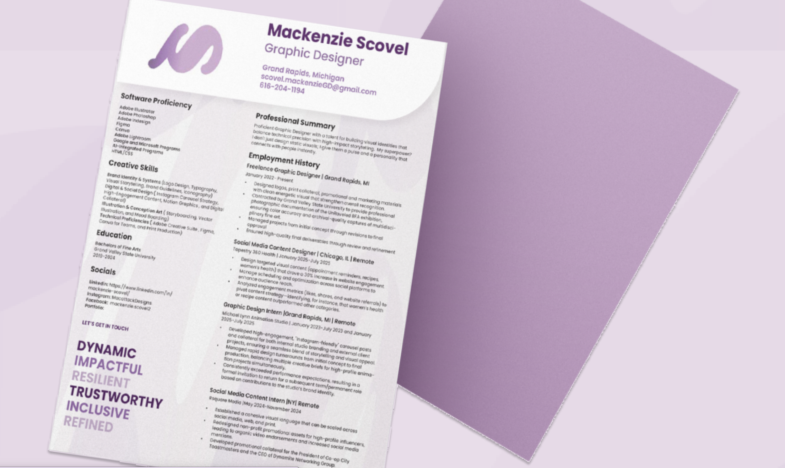
Resume