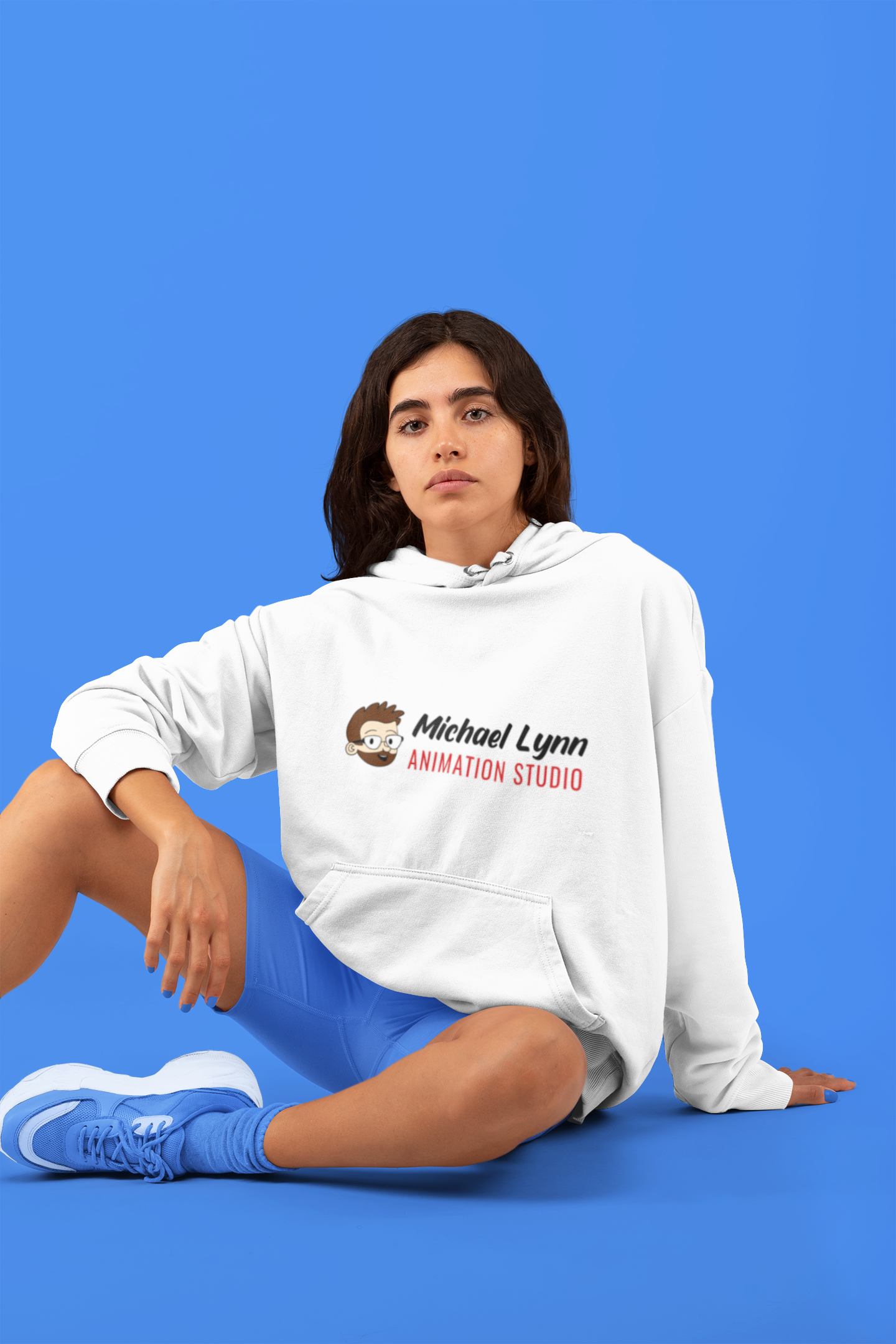
Michael Lynn Animation Studio Logo Design
The company Michael Lynn Animation Studio, asked me as one of their graphic design interns to do a complete revamp of their main business logo. I was told that, I get to set the stage with designing it, so color palette and type were basically free range for me; I just had to include the animation character of the owner in the design.
Problem
Outdated Visuals: The original logo lacked distinct character and failed to reflect the studio’s current creative energy.
The Challenge: To inject personality and modernization into a stagnant brand mark
Solution
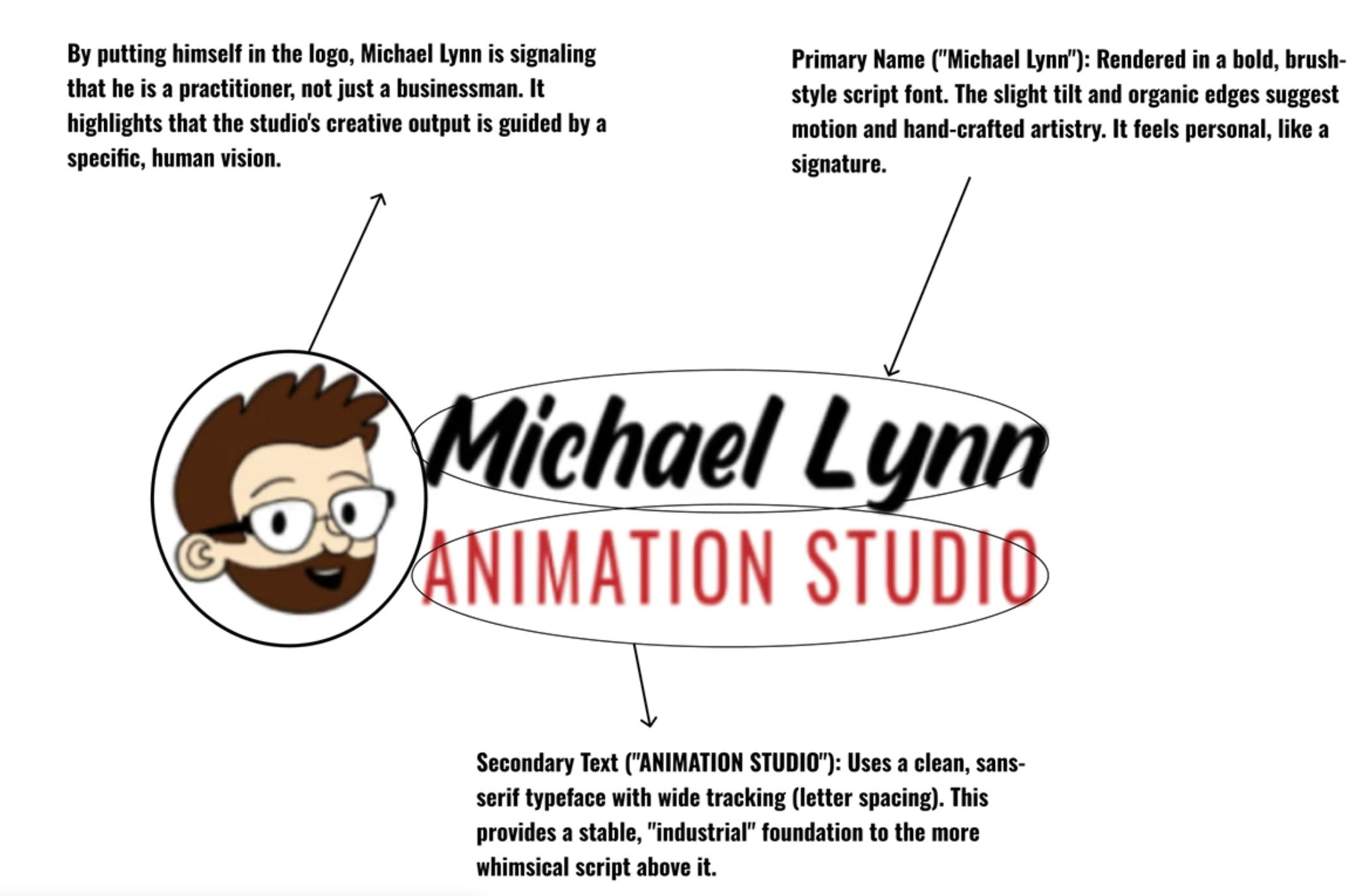
Strategic Portraiture: Integrated a custom-illustrated portrait of the own to humanize the brand and create an instant connect.
Market Shift: Moved beyond a simple “logo fix” to fundamentally reshape the companies identity and market presence through design.
Target Audience
Primary:
Direct Clients
Secondary:
Platforms & Viewers
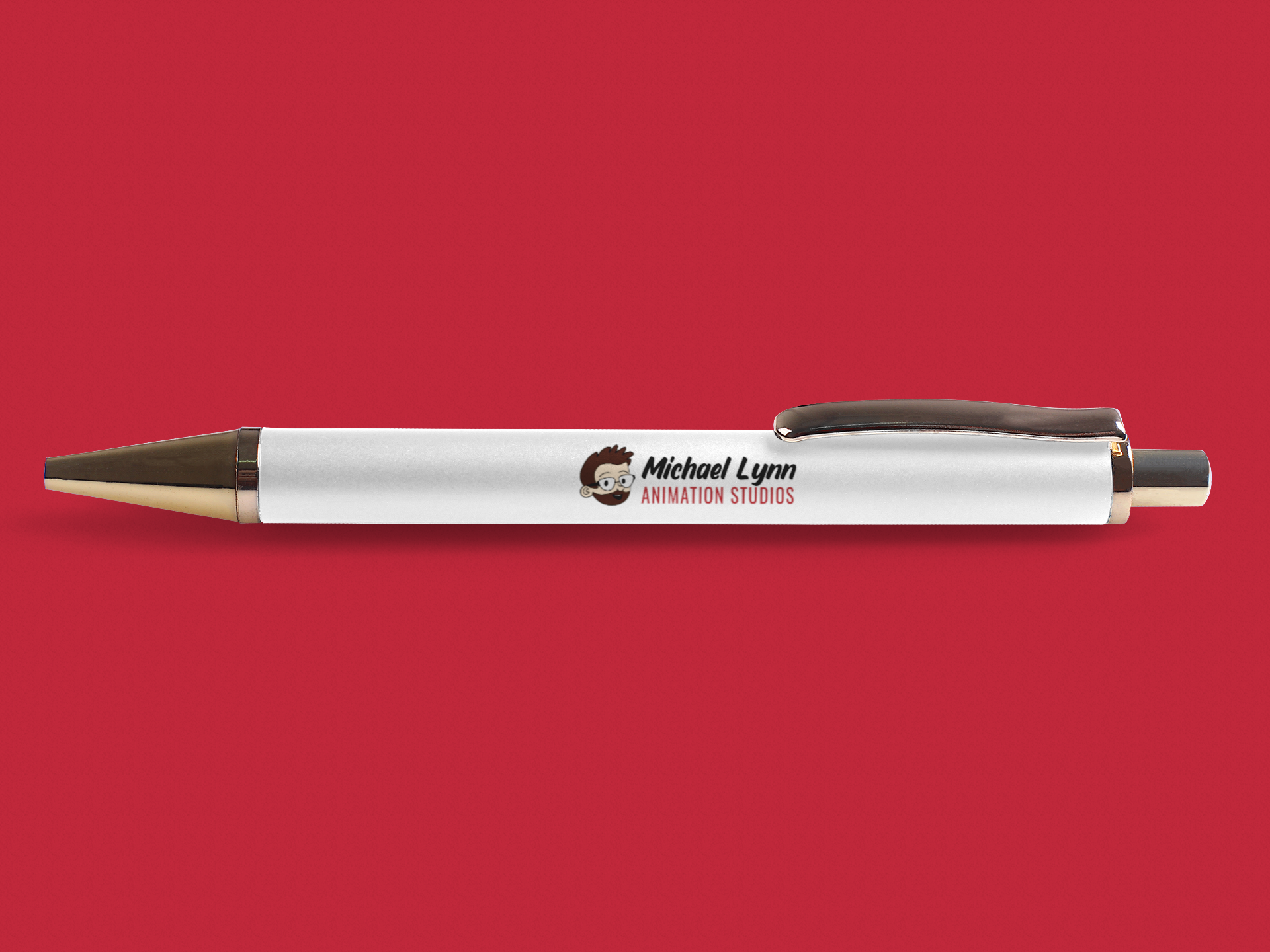
User Personas

Meet Sarah
Age: 36
Title: Executive Creative Producer at a Mid-Sized Gaming & Entertainment Network
Bio: Sarah manages a roster of multi-media projects and frequently outsources specialized animation work. She is constantly searching for reliable, highly imaginative animation studios that can deliver premium storytelling on strict production schedules. She values professionalism but expects an animation studio's brand to look visually exciting and cutting-edge.
Goals: * Find a creative partner capable of translating script concepts into dynamic, high-quality motion design.
Ensure the studio is technically proficient, versatile, and collaborative.
How the Logo Speaks to Her: The clean yet energetic geometry of the logo instantly signals professional stability and high-end industry authority. The imaginative design elements reassure her that the studio possesses the unique creative spark needed to elevate her network’s intellectual properties.
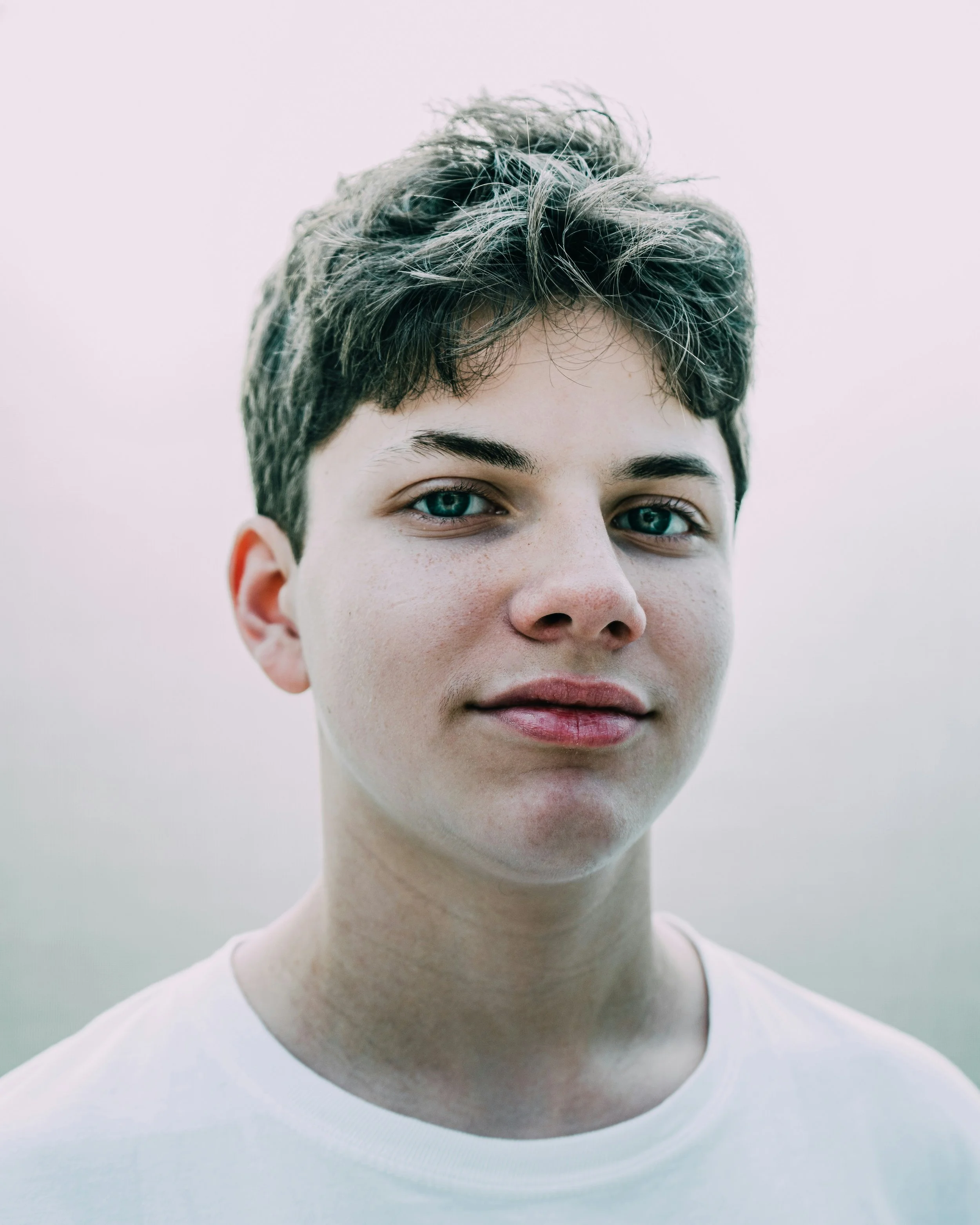
Meet Marcus Chen
Age: 25
Title: Freelance 3D/2D Character Animator
Bio: Marcus is a rising talent in the animation industry. He wants to collaborate with studios that push creative boundaries and foster a visionary culture. He judges a studio almost entirely by its visual presentation; if their branding feels dated or corporate, he assumes their projects will be uninspiring.
Goals:
Collaborate on high-profile, innovative storytelling and interactive projects.
Align himself with a studio brand that feels modern, inspiring, and artist-centric.
How the Logo Speaks to Him: The logo's bold typography and fluid, dynamic symbolism tell Marcus that Michael Lynn Animation Studio values artistic innovation and forward-thinking design. It makes him proud to display their name on his credit list or portfolio.
Visual Guide
INSPIRATIONAL MOODBOARD
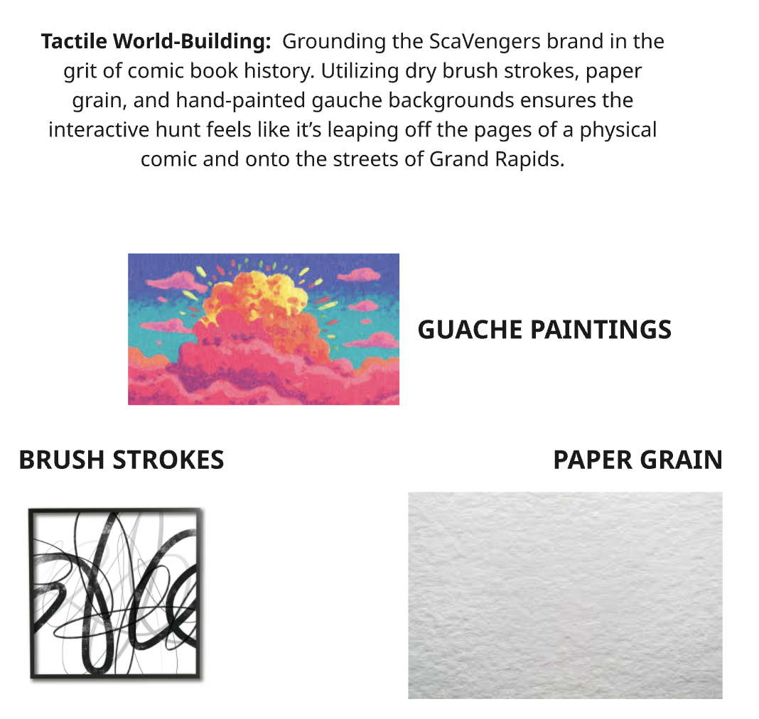
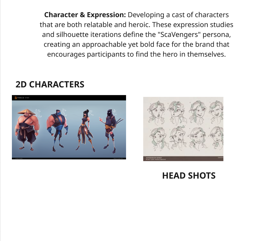
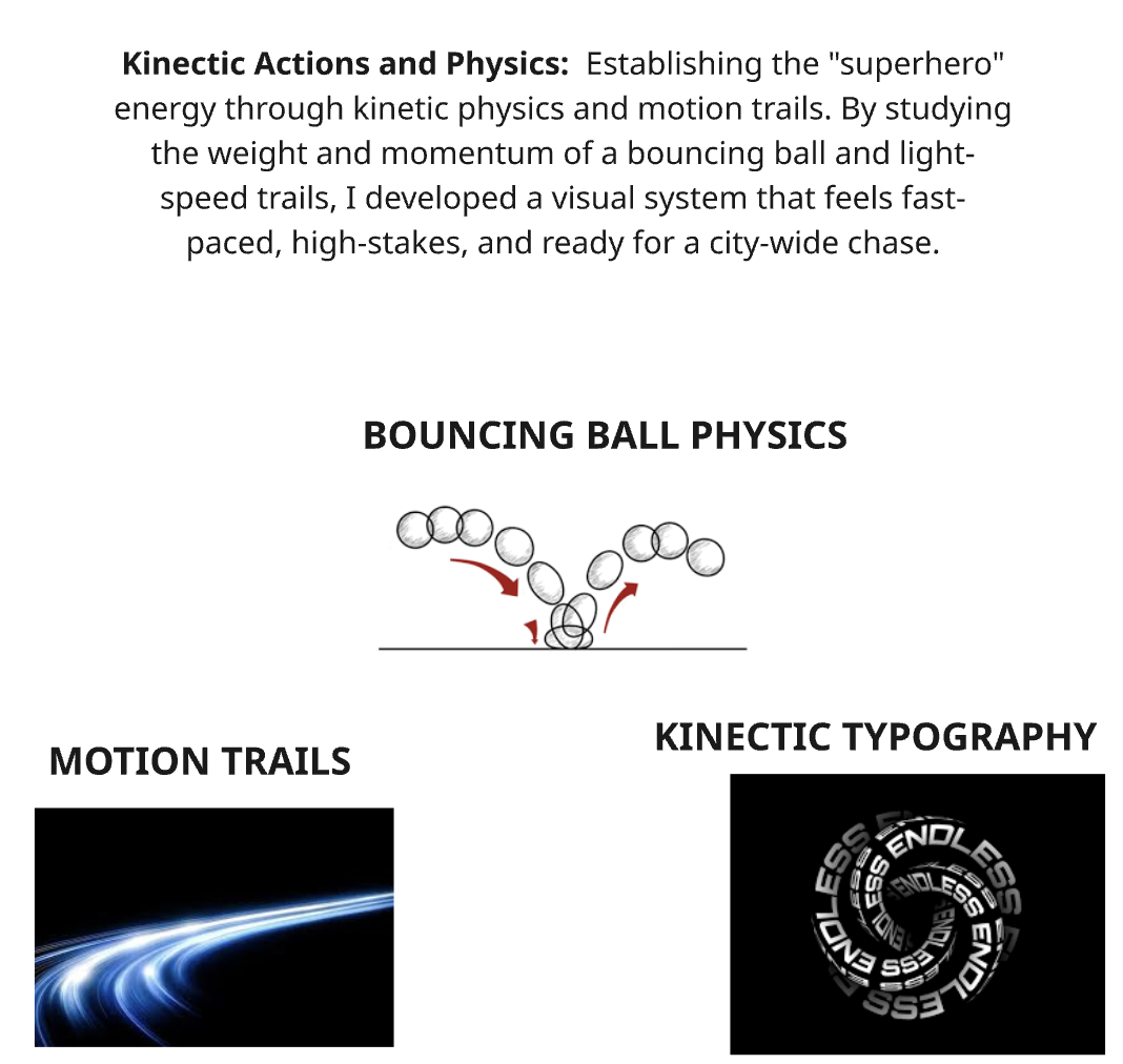
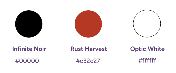
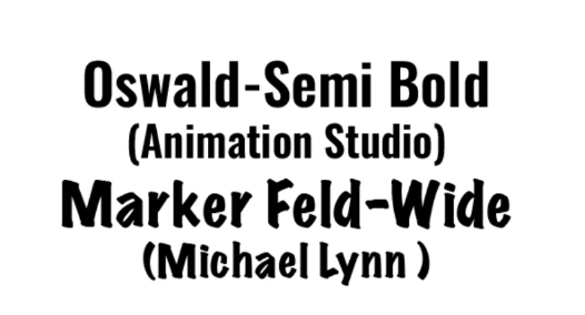
Logo Proof
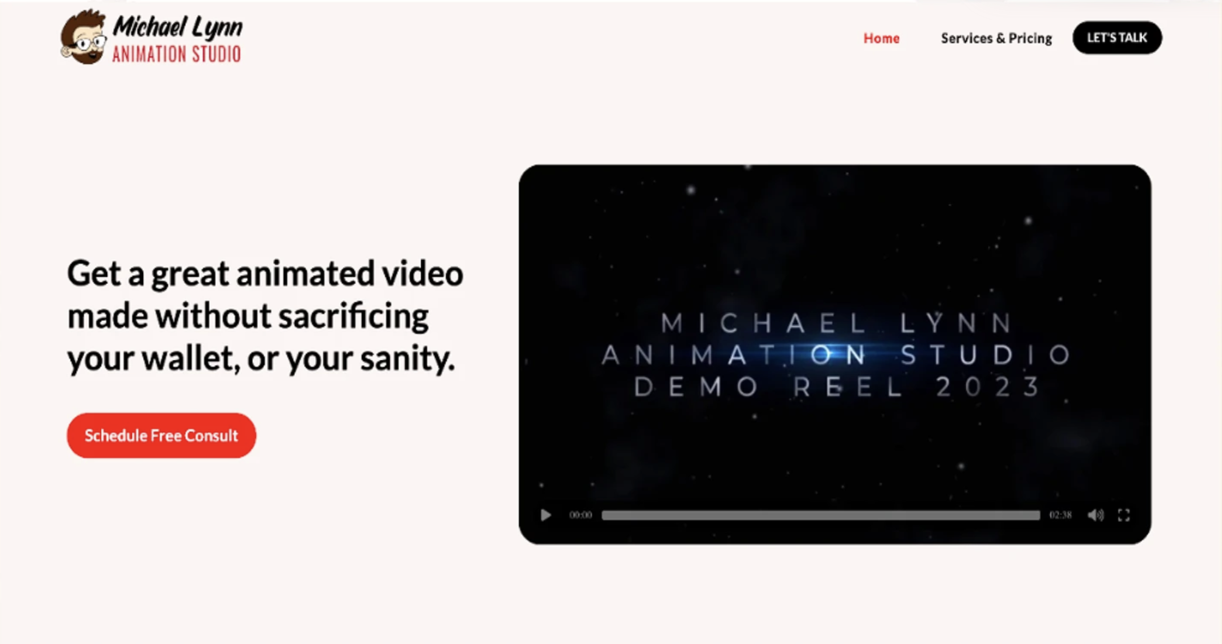
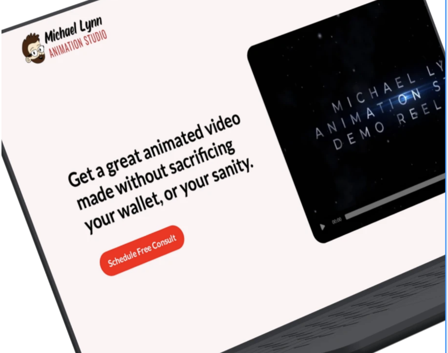
From Concept to Reality: The finalized identity system as seen on live Michael Lynn Animation Studio website.
Logo Transition
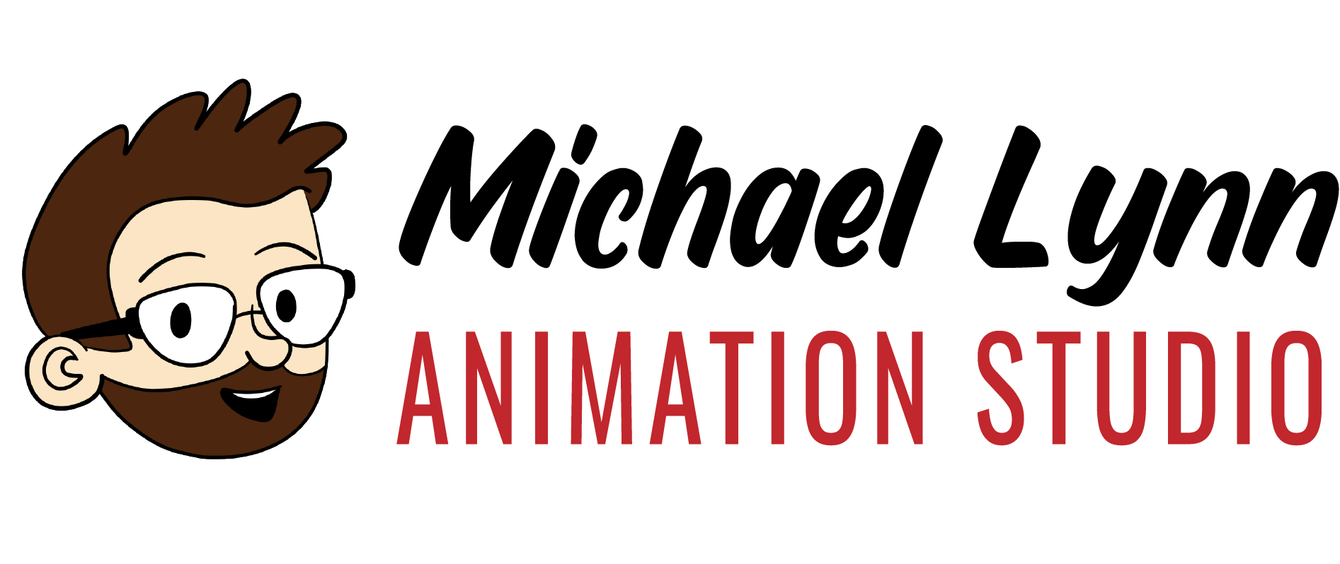
The brand evolution for Michael Lynn Animation Studio shifts from a simple text layout to a character-driven identity. By introducing a friendly mascot avatar, the logo establishes an instant personal connection. The typography jumps from a rigid comic font to a fluid, forward-leaning script that conveys motion, while the color palette matures from bright primary red to a sophisticated brick-red and warm brown. The result is a cohesive, professional, and memorable studio brand.
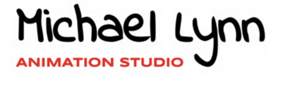
BEFORE
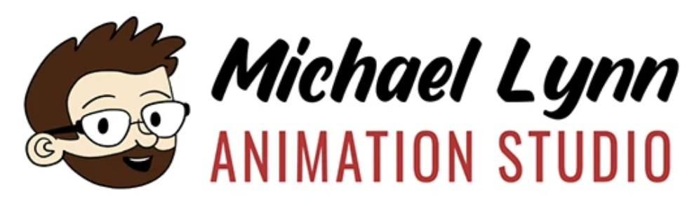
AFTER
Process
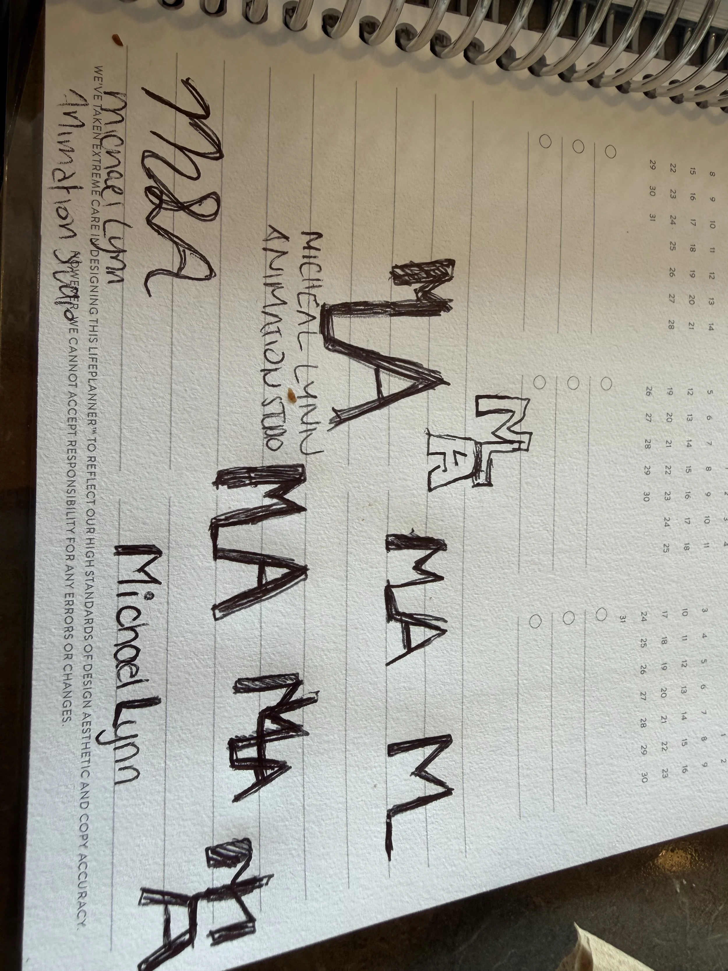
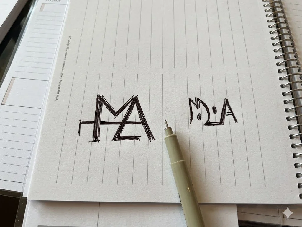
SKETCHES
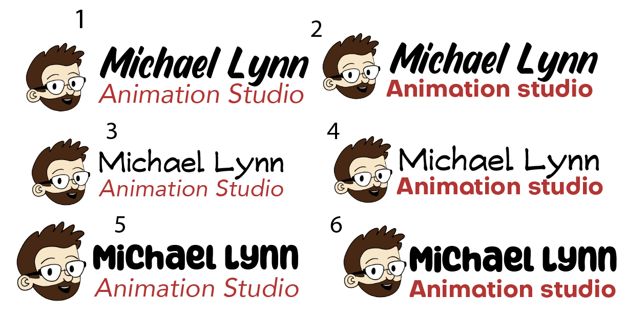
DIGITAL ITERATIONS
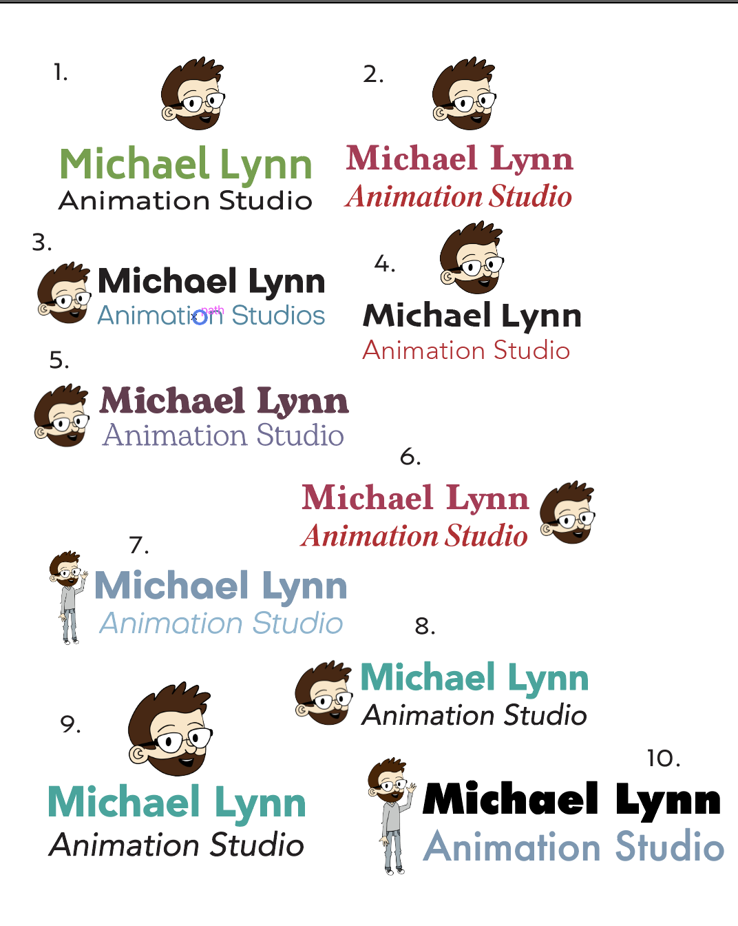
Logo Breakdown